________________
MORE BACKGROUND ON WORKS OF ART . . .
________________
Girl with a Pearl Earring
Much like the Mona Lisa, the subject of Johannes Vermeer’s Girl with a Pearl Earring has been highly contested—but for the most likely candidate, Vermeer didn’t have to look far. The model for his painting is thought to be his daughter Maria.
Vermeer may have used mechanical means to create this painting and many more. The Dutch master's distinctive style avoids hard lines, relying on shades of light and shadow alone. Art historians have long debated whether mechanical means may have helped Vermeer render light in this way. A camera obscura is the most popular theory, and the 2013 documentary Tim's Vermeer followed an experiment that seemed to prove that Vermeer's method included a careful arrangement of mirrors to guide his hand in painting.
This priceless painting sold for next to nothing. More than two hundred years passed between the painting's creation and its sale at auction in 1881. There, Dutch Army officer and art collector Arnoldus Andries des Tombe purchased Girl with a Pearl Earring for just 2 guilders with a 30-cent premium. Upon des Tombe's death in the winter of 1902, the work was willed to The Hague's art museum the Mauritshuis, where it can still be seen today.
Some variations:
Banksy’s version, with a security camera in lieu of the pearl earring.
________________
American Gothic
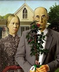
Grant Wood’s American Gothic depicts —for better or worse—the ideals of rural America. Wood wanted to use his mother, Hattie, as a model for his painting but felt that standing for so long would be far too exhausting for his mother, so he had his sister wear his mother’s apron and pin while posing. For the male subject in the painting, Wood used his 62-year-old dentist.
Some variations:
________________
Nighthawks
Edward Hopper allegedly based his painting Nighthawks on a diner that was located in New York City’s Greenwich Village in an area where Greenwich Street meets 11th Street and 7th Avenue called Mulry Square. However he actually based the painting on an all-night coffee stand. According to him “I simplified the scene a great deal and made the restaurant bigger. Unconsciously, probably, I was painting the loneliness of a large city.”
Grant’s wife Josephine kept notes of events and works in progress. Her notes about Nighthawks include the possibility that the painting's title may have had its origins as a reference to the beak-shaped nose of the man at the bar, or that the appearance of one of the "nighthawks" was tweaked in order to relate to the original meaning of the word:
Night + brilliant interior of cheap restaurant. Bright items: cherry wood counter + tops of surrounding stools; light on metal tanks at rear right; brilliant streak of jade green tiles 3/4 across canvas--at base of glass of window curving at corner. Light walls, dull yellow ocre [sic] door into kitchen right. Very good looking blond boy in white (coat, cap) inside counter. Girl in red blouse, brown hair eating sandwich. Man night hawk (beak) in dark suit, steel grey hat, black band, blue shirt (clean) holding cigarette. Other figure dark sinister back--at left. Light side walk outside pale greenish. Darkish red brick houses opposite. Sign across top of restaurant, dark--Phillies 5c cigar. Picture of cigar. Outside of shop dark, green. Note: bit of bright ceiling inside shop against dark of outside street--at edge of stretch of top of window.
Other versions:
Italian version
________________
The Persistence of Memory
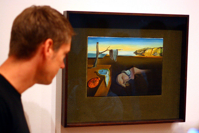
Though Salvador Dali sought to never explain his own work, he has said that the idea for his iconic melting clocks came from chunks of Camembert cheese he observed melting in the sun—although he may have been joking.
The Persistence of Memory was painted in the midst of a hallucination. Around the time of the painting’s 1931 creation, Dalì perfected his "paranoiac-critical method." The artist would attempt to enter a meditative state of self-induced psychotic hallucinations so that he could make what he called "hand-painted dream photographs." “I am the first to be surprised and often terrified by the images I see appear upon my canvas," Dalì wrote, referring to his unusual routine. "I register without choice and with all possible exactitude the dictates of my subconscious, my dreams.”
Although the painting is only 24cm x 33 cm (9.5 inches x 13 inches), the painting made him famous. The press and the public went mad for him when The Persistence of Memory was shown at the Julien Levy Gallery in New York City in 1932.
Other versions:
________________
Campbell’s Soup Cans
Andy Warhol’s 1962 Pop Art depiction of a Campbell’s Soup can actually comes in a set of 32 silkscreened canvases, each representing the 32 separate soup varieties that the company sold at the time. Warhol never gave instructions on how to display them, so the Museum of Modern Art arranged them chronologically in the order in which the soups were introduced by Campbell's.
Warhol's production of Campbell's Soup cans artistic works underwent three distinct phases. The first took place in 1962, during which he created realistic images (above), and produced numerous pencil drawings of the subject.
In 1965, Warhol revisited the theme while arbitrarily replacing the original red and white colors with a wider variety of hues.
In the late 1970s, he again returned to the soup cans while inverting and reversing the images.[59] The best-remembered Warhol Campbell's Soup can works are from the first phase.
Interesting fact:
In 2016 seven of the iconic Warhol Campbells Soup can prints were stolen from the Springfield Art Museum in Missouri. After a year the FBI was still looking for the missing soup can prints so it created a notice to seek public assistance.
The “Seeking Information” notice was an official document released by the Bureau’s Kansas City office, posted April 7, 2016 on its website. It showed the seven soup can prints of different flavours—from “Black Bean” to “Onion”— missing since the Springfield theft. Warhol’s idea was to mimic Campbell advertisements in their repetition and the uniformity of the images. The FBI did the same on its notice.
Coincidentally, the FBI poster’s header carries a burgundy colour scheme that is standard for most other FBI “Seeking Information” notices but, in a nice touch, also matches the original soup cans.
Link to the FBI site:


No comments:
Post a Comment
Note: Only a member of this blog may post a comment.