________________
The following selection, includiing headings and selected public comments, are from Bored Panda at: https://www.boredpanda.com/worst-design-fails/
Caution: risque content included.
________________
________________
I'd Better Get That Ticket Before It's Too Late
Comments:
Suddenly the ticket option seems a lot better.
This is not a design fail. Just a funny pic.
Kind of a design fail, since you can't read the entire sign...
It's a sign fail
_______________
Kansas City Really Lets Tourists Have A Good Time
Comment:
No wonder Dorothy left
________________
It's Pretty Good Advice
Comments:
Okay, so we can only run over 20 children max. Got it.
Oh, what a relief! I only have 19.
________________
I Present To You The "Graeme Clark Oration Award For Science Innovation". It's Supposed To Be Two Hands Peeling Away Layers Of The Earth
Comments:
Also used at the college of midwives
and possibly gynecologists.
________________
This Guy Must Be Feeling Pretty Great On This Ad
Comments:
Just wait until the exhaust pours out for the full effect.
he looks exhausted...
________________
Happy Wedding Shower, Jana. Love The Sign!
Comments:
ok...so backwards it is different. from behind, that is
Pun intended?
________________
Never Get High On Your Own Supply
Comments:
*flipping through the dictionary, sees the photo under "irony", is at peace*
This one took me a minute, hahaha!
________________
This Is Why You Can't Put Spelling Questions On A Laptop Test
Comments:
I bet you'd still find people giving the wrong answer anyways. I remember someone interviewing people in the street asking for the first name of Barack Obama. They used his full name asking the question. A lot of people where still thinking it over. Lol
________
In Honor Of Passover This Weekend
________________
Apparently Incest Is Perfectly Fine
________________
Um . . .
Comments:
You want a wall there? Fine, I'll give you a wall
________________
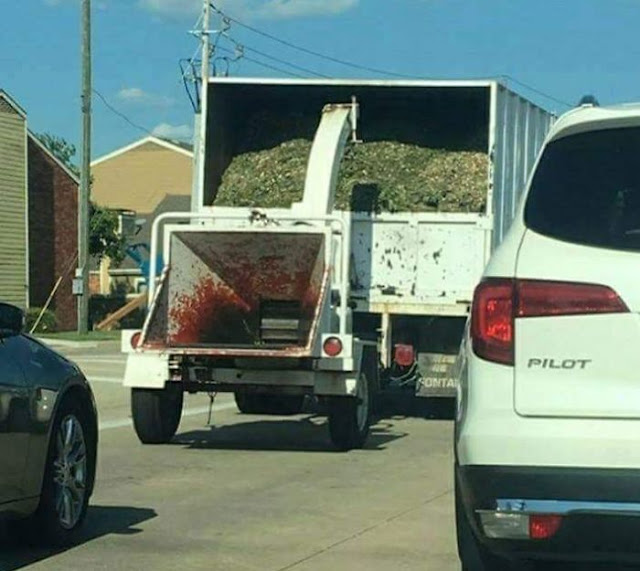
Who's Bright Idea Was It To Undercoat The Wood Chipper Red?
Comments:
That’s not an undercoat....
Looks like Dexter used it!
________________
Bonus Level
Comments:
Literally 'water closet’
Ahh yes, the emergency urinal.
________________
"You're Gonna Pay For That Free Coffee, Aren't You?"
________________
Would Anyone Like A Bag Of Mice?
Comments:
it's ok, they have a stuffed black cat on the case!
Great, now I don't have to go to the pet store to get frozen mice to feed my snakes
________________
This "M" On A Kids Menu Activity
Comments:
What bothers me is J, U, and Q are missing. Juq’s on YOUU HA GOTIIII
There’s no N. J, Q, U and a spinal chord in this photo
Why am I more disturbed that there are several letters missing?
________________
The Penis Mightier Than The Sword
Comments:
Kerning is important.
________________
Now That's Just A Bad Logo. Period.
Comments:
She sneezed.
That takes bad to a new level


No comments:
Post a Comment
Note: Only a member of this blog may post a comment.